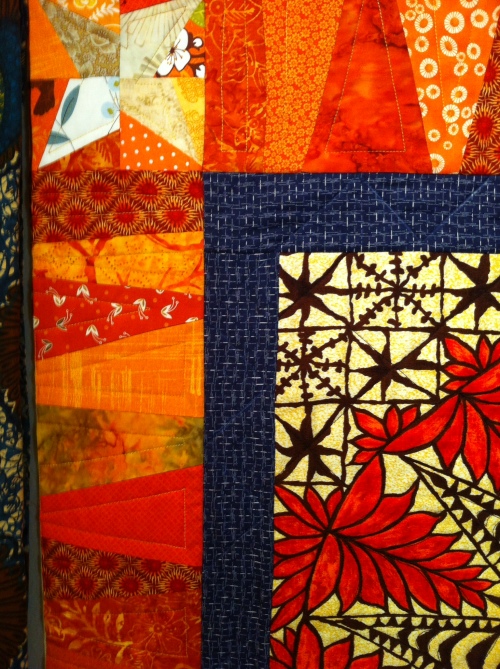
I started this quilt some months ago. There are a lot of new techniques in it for me–liberated piecing, quilt-as-you-go, and a medallion style.
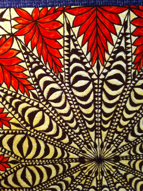
The center of the medallion is a piece of 60s Hawaiian bark cloth that I found years ago at an estate sale. I always pictured it as the “cheater” center of a quilt. Last winter when I was going through a hard time, I picked it up and began quilting it without much thought as to where the quilt would go next. But then I dug out a bunch of orange and blue scraps and added the borders. The orange radiated happiness and it lifted my spirits. The freestyle piecing was so quick and satisfying. But since then, I’ve been stuck.
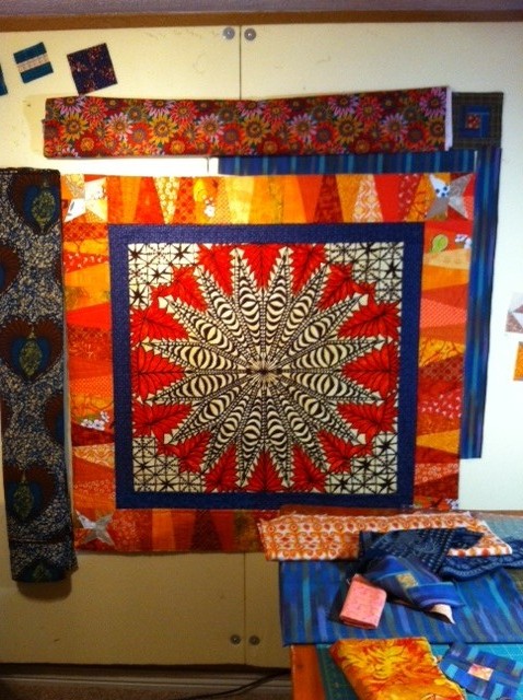
Every time I head into my studio, I just end up folding yardage and pinning it to the wall in various configurations. Sometimes I piece a few blocks and arrange them. I drink a glass of wine and stare, rearrange, and repeat. I’ve done this endlessly. I can’t figure out what or where to go next. Here is how it looks at the moment:
The fabric on the left is another vintage find which has a terrific bold print that is reminiscent of the center medallion yet quite different. The top has a couple of border auditions of Kaffe Fasset fabrics. I think I have to decide if I want to do another intricately pieced border–or several and “busy it up”–or if I’d like to let bold fabrics do the talking. One thing I want is to keep the vibrancy. In my head, this is a happiness quilt and I don’t want to lose the gift it gave me last winter by dulling the palate. I also don’t want to fall into an orange blue orange blue pattern.
Any ideas most welcome!


LOVE it so far. And I totally get how stuck you are. I have an “ethnic” piece in blacks, bark cloth, and brights and I’m rather stuck, too.
Of what you’re showing here, I like the blue stripe best as the next border. It echoes the blue interior border and maintains the vibrancy of the orange. And if you turn it so the stripes are as on the top (rather than the right), it looks intricate (pieced stripes?) and repeats the “stripe” of the orange border. But it has enough contrast and tension with the orange piecing to still be interesting. I wouldn’t make the blue any wider than the one you already have, maybe a lot narrower if you want to de-emphasize it.
I’m wondering about the print on the left. It looks like a heart motif. Not sure about this but I wonder about fussy-cutting the hearts. …
To keep from a “orange blue orange blue” pattern, you should look at what other colors you’re using. You have black and cream and reddish-orange in the center. Anything else there? Also what about all the prints in the orange border? They aren’t solid colors, so there’s something there you can work with. And of course look at the analogous colors…
This is an exciting project! Makes me think I should go back and try some new things on mine. Thanks for the inspiration.
LikeLike
I can’t believe I only just saw this tremendously helpful comment! You can tell I am new to this. Thank you so much for the suggestions–I am definitely leaning toward using that blue stripe you mention for the next narrow border because it has a lot of different colors in it besides blue. I have another piece of bark cloth that I bought with the medallion that I could fussy cut with too. I think I am leaning toward wild….Stay tuned!
LikeLiked by 1 person
Here’s a link to mine. You inspired me so well I finished my top!!!!!
THANKS!
LikeLike